Searching the web
"Searching" is the most common action performed on the internet everyday. Google alone receives 40,000 search queries every second (3.5 billion searches per day on average). That is a lot of queries. That also means there is a great deal of user interaction taking place between what is essentially a single text input and a list of outputted data. So, why has barely any UI/UX improvements been introduced over the years? I find it difficult to assume that the current "search engine design" has achieved perfection since there are so many obvious flaws.
Let's take a stab at enhancing this extremely important user interface and see if we can evolve the search engine experience.
Default search engine results (DuckDuckGo)
For our baseline example we will use the DuckDuckGo search engine. If you aren't currently using DDG as your default search engine, I recommend that you make the switch. Google has continually proven that they shouldn't be trusted with user data, nor do they have their customers' well being and privacy at the forefront of their priorities. I've talked about ditching Google in the past if you're interested. </End rant>
This is what a default search result for the term "canada" returns:
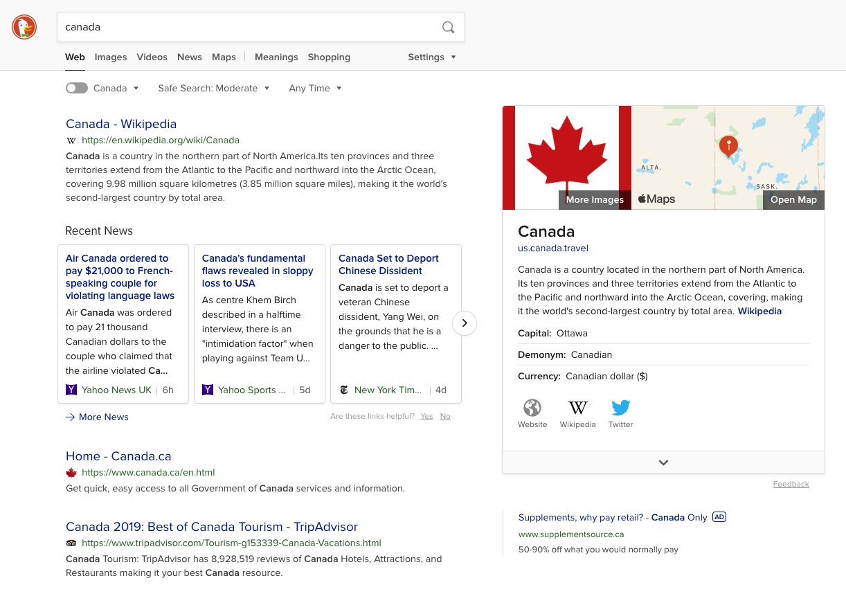
Overall the design is clean and focuses on exactly what the user cares about: the content. A quick, detailed pane is presented to the right of the top list results, giving the user an easy overview of the searched query. I have no real complaints about the visuals. The overall UX is a different story.
Respecting user limitations
Not everyone has unlimited data usage or fast internet. In fact, reliable internet is more of a first-world luxury that is often taken for granted. Many people (specifically those on restricted mobile plans or low-end, under-powered devices) can't afford to eat through their data caps when performing something as simple as an internet search. For some, these under-powered devices may be their only way to connect to the web. By forcing items like tracking scripts or injected advertisement media onto the users' devices, you're stealing away what little available data they have. You're also doing this while providing zero positive gain for the users themselves.
Introducing page size results
Why not give the user the ability to instantly know how much data each listing will consume before they commit to actually visiting that website? By introducing a simple toggle filter at the top of the search results (I would advocate to have this active by default) you give the user a quick-and-easy way to see each listing's total page size. Take a look at the concept of this idea below:
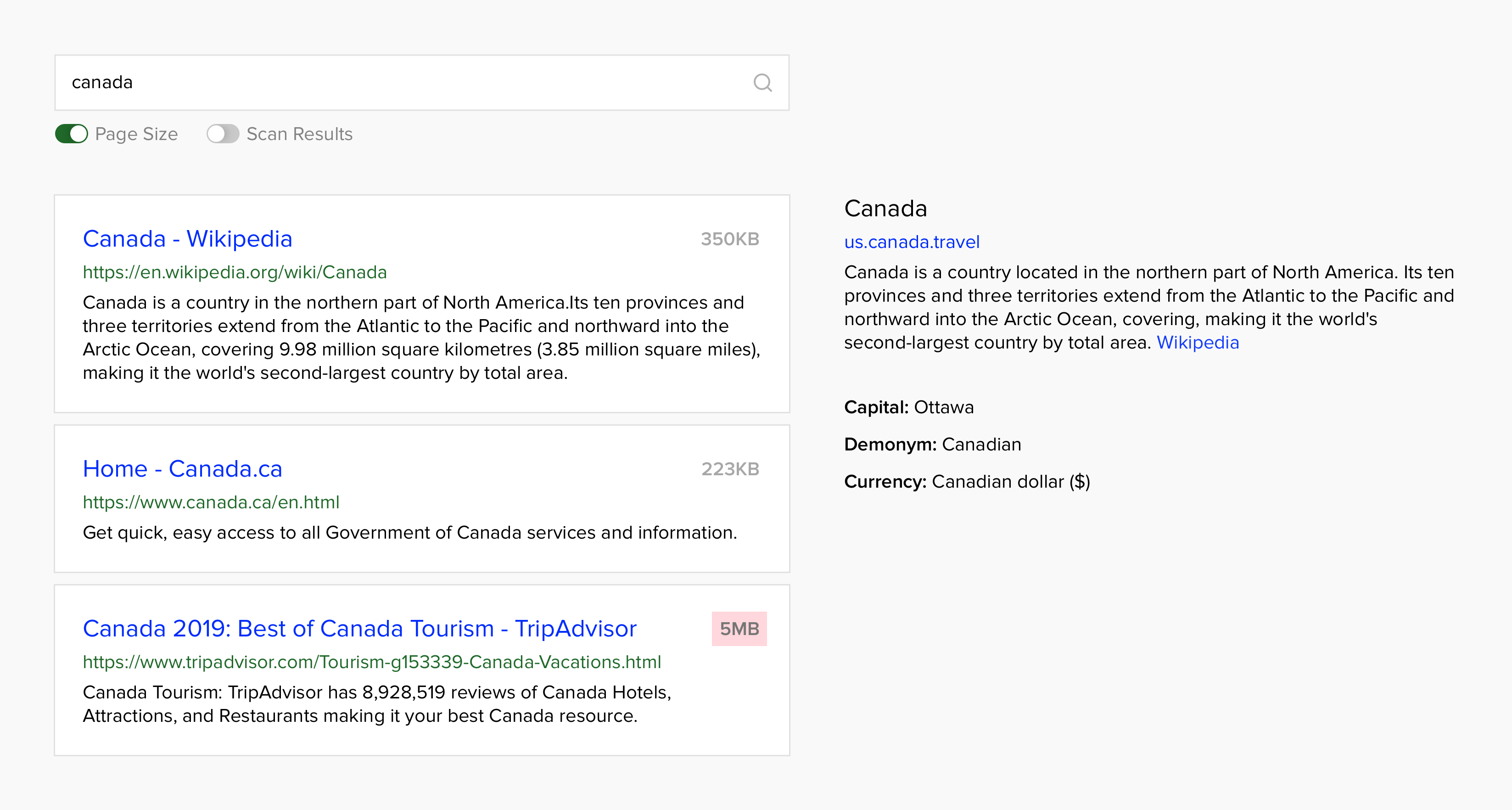
In the top right section of each listing the user can now see how "heavy" each webpage item is. By displaying the page weight, users have a better understanding of which sites will be faster and easier on their data caps - based on a very simple addition.
An indirect consequence (but overall a great bonus) of this page weight element being standard, is companies would be forced to review their current websites/apps, as to avoid being flagged.
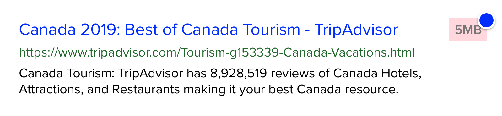
• Page Size Indicator
This element would show the final size of the entire webpage the listing is linked to. Default styling would display this as a minimal, grey text item. Webpages with a total webpage size of 1MB or greater would be styled in a way to warn the user of a large download requirement. (Light red background to attract immediate attention)
Scanning results
Having the ability to know the weight of a given listing is great, but what about privacy? Including an option to tell the user which listings will track, send your data to 3rd-party services, or display obnoxious ads should be more important than your data consumption. This can also be implemented with a simple UI:
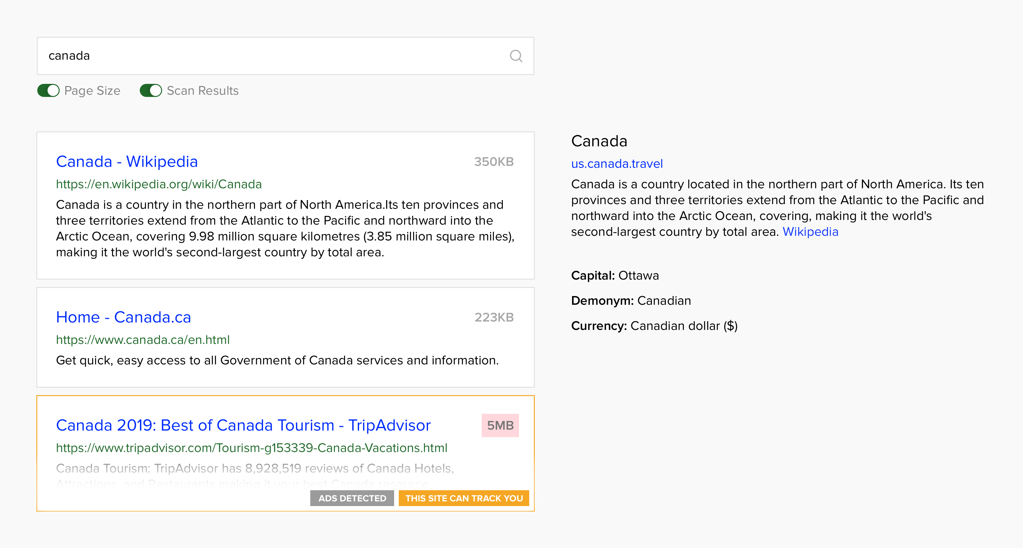
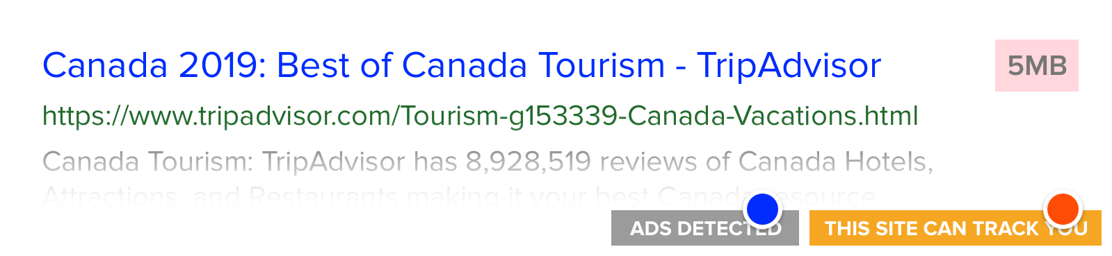
• Ads Indicator
This tag element is added to listings that contain certain flagged advertisement scripts (Google adsense, carbon ads, buysellads, etc.). Advertisements don't necessarily mean a bad experience, so their styling is designed as more informational.
• 3rd-Party Scripts Indicator
The tracking tag element is designed in a way to indicate a warning to the user. These scripts tend to ignore user privacy, so they have more importance to the user's security. These would include (but not be limited to) Google Analytics, Kissmetrics, Mixpanel, Chartbeat, etc. This element might also be a good way to "upsell" the user on using script blocking extensions like Ghostery or uBlock.
Companies reliant on advertisements
Won't companies dependent on embedded advertisements and tracking scripts push-back against this design concept? Probably.
But too bad. My message to companies who rely on beefy ads and follower their users wherever they go, as a means to make a profit: Adapt or die.
Ruining your users' experience for the sake of monetizing your business is bad for said business in the long run. Personally, I believe it's border-line unethical. Your users never consent to these 3rd-party tracking scripts or give permission for you to force-download megabytes of data.
Stop feeding your customers garbage and you won't have to worry about more detailed search results. You'll be one of the good guys 👍. Figure out a way to make money without screwing over your users. It's just lazy to say "there is no other way" before even trying something else.